iOS 26 beta 3 dials back Liquid Glass
In a significant development reflecting user feedback, Apple has released the third developer beta of iOS 26, which notably tones down the prominent “Liquid Glass” design language first introduced earlier this year. This adjustment comes in direct response to widespread complaints from users who found the initial highly translucent interface challenging for readability and overall navigation.
The “Liquid Glass” design, unveiled at Apple’s WWDC 2025 in June, was conceived to emulate the optical characteristics of real-world glass, emphasizing light refraction and transparency. While its aesthetic innovation was initially lauded, the practical implementation in the first developer beta of iOS 26 and subsequent updates across other Apple devices revealed considerable opportunities for enhancement in terms of user experience and legibility.
Apple began addressing these concerns last month with the release of iOS 26 beta 2, which specifically fixed critical issues such as the excessive transparency within the Control Center. This initial patch aimed to mitigate visual clutter caused by Home Screen icons and widgets showing through, thereby enhancing clarity for users.
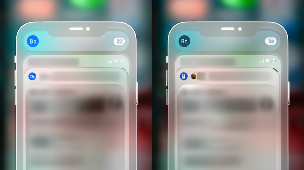
Monday’s release of iOS 26 beta 3 represents a further refinement of the Liquid Glass aesthetic. This latest beta shifts its focus to other core areas of the mobile operating system, including Notifications and the navigation interfaces within Apple’s proprietary applications, such as Apple Music.
For example, the navigation bar in the Apple Music application, which previously featured a subtle transparency allowing background elements to be faintly visible, now presents a more solid, opaque white appearance. This change is designed to significantly boost text contrast and improve overall readability within the app.
Similarly, notifications have undergone adjustments to reduce their translucency. The background behind notification text has been deliberately darkened, resulting in a clearer and more legible display of incoming alerts, directly enhancing user accessibility and interaction with timely information.
However, Apple’s continuous iterative adjustments have sparked renewed discussions within the developer community. Some users contend that the company has now gone too far in reducing the glassy effect, suggesting a reversion to a “frosted glass” aesthetic rather than the initially envisioned “Liquid Glass.” Noted tech journalist Mark Gurman expressed this sentiment on X (formerly Twitter), stating, “Announce a huge redesign just to throw much of it away. Apple should be allowing users to choose how much glass they want instead of just reversing by 75%. At least rename it now to Frosted Glass. Lol.”
Other prominent voices echoed similar perspectives. Benjamin Mayo tweeted about “iOS 26 beta 3 featuring Diluted Glass,” while xadacka (Florian Stravock) commented, “ios 26 beta 3 is a complete cop out, they just rolled back the glass rather than making it work well. frosted glass with dark backgrounds is what it is now.” Conversely, some users conveyed frustration regarding the rollback, such as @cloudoca tweeting, “They nerfed tf out of Liquid Glass in IOS 26 beta 3 thanks to some of yall whining mfs.” Omar Santiago also shared a visual comparison, lamenting, “Es ABSURDO lo que Apple está haciendo con Liquid Glass en iOS 26 beta 3… iOS 26 cada vez es mas iOS 18 en cuanto a diseño.”
It is vital to underscore that these are developer betas—pre-release versions of the mobile operating system. The fundamental purpose of beta software is to facilitate extensive feedback collection, identify and rectify bugs, and resolve usability concerns before the official public release, typically scheduled for the fall. Consequently, Apple is anticipated to continue refining the Liquid Glass design, aiming to strike an optimal balance between its compelling visual appeal and practical legibility across all applications and screens.